Waves - Symbols
Waves contains several symbols, but each belongs to one of three ideas: momentum crosses, divergence, or agreement with an additional filter. Use this page as a legend when a marker appears.
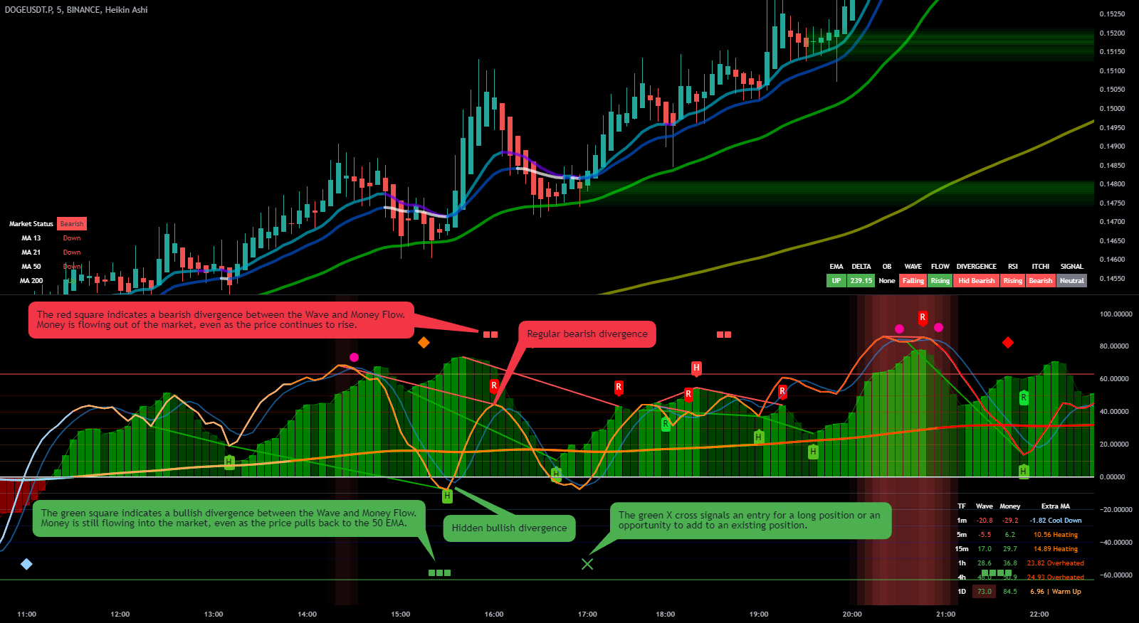
Green and Red Bars: MoneyFlow Histogram
- MoneyFlow Histogram: The green bars show increasing MoneyFlow, indicating positive momentum, while red bars show decreasing MoneyFlow, highlighting negative momentum. This histogram provides a quick view of where the money is flowing.
Use the MoneyFlow Histogram to confirm bullish or bearish momentum at a glance—green suggests buyers are active, while red indicates selling pressure.
Light Blue and Orange Lines: Wave and WT2
- Wave (WT1): The light blue line represents the core trend oscillator, measuring market momentum and trend direction.
- WT2: The orange line is a smoothed moving average of Wave. Crossovers between Wave (WT1) and WT2 show changes in short-term momentum.
Watch Wave and WT2 crossovers as changes in short-term momentum. A cross above is bullish; a cross below is bearish.
Red and Green "R" and "H" Labels: Divergence Markers
- R (Regular Divergence): When price moves in one direction while Wave diverges, this signals a potential reversal. The "R" label marks these discrepancies.
- H (Hidden Divergence): The "H" label indicates a hidden divergence, which can support continuation of the current trend.
Look out for regular divergence as an early sign of trend reversal, especially in conjunction with other signals like MoneyFlow or WT2.
Colored Diamonds: Continuation Signals
- Blue Diamond: Indicates a continuation of a bullish trend, suggesting that bullish momentum is holding strong.
- Orange Diamond: Signals a continuation of a bearish trend, suggesting caution against taking countertrend positions.
Consider blue diamonds as a "thumbs-up" for ongoing bullish conditions, and orange diamonds as a warning to maintain bearish positions.
Red "X" and Triangles: Sell Signals
- Red X: A strong sell signal triggered when WT1 crosses below WT2, with MoneyFlow in a confirming opposite condition.
- Red Triangle: A weaker sell signal, appearing when WT1 crosses below WT2 but lacks full confirmation from other indicators.
The Red X includes EMA confirmation; the Red Triangle is the same bearish opposite-cross idea without that confirmation. The bullish symbols follow the same logic.
Red and Green Squares: Divergence Squares
- Red Square: Indicates decreasing MoneyFlow while Wave is rising, signaling weakening upward momentum.
- Green Square: Shows increasing MoneyFlow while Wave falls, suggesting a potential bullish reversal.
Use red squares as a heads-up for possible declines and green squares as early signals of a bullish reversal.
Right-Side Data Table
- TF (Timeframe): Shows key metrics for different timeframes (e.g., 1m, 5m, 15m).
- Wave and Money: Displays the current Wave (WT1) and MoneyFlow values across timeframes, offering a complete view of market trends.
- Extra MA: Indicates the state of Extra Moving Average in various timeframes, using terms like "Chilling" or "Heating" for quick interpretation.
When several timeframes show similar Wave or MoneyFlow direction, the current reading has broader support. Misalignment means the move may be local or transitional.
Bubbles with Text: On-Chart Labels
- Red Bubble (WT and Signal): Shows current values for Wave (WT1) and WT2 at a specific candle, providing quick reference for crossovers.
- Blue and Red Bubbles (MoneyFlow and Extra MA): Indicate current status of MoneyFlow and Extra MA, with descriptive states like "Chilling" or "Heating" for quick context.
Use these bubbles to quickly check if you're approaching a crossover or a critical MoneyFlow condition, without taking your eyes off the chart.
Quick Tips for Reading the Chart
- Green generally marks bullish conditions and red marks bearish conditions.
- Symbol shape explains the condition; color alone is not enough.
- Read Wave and WT2 crosses together with MoneyFlow and price location.
Conclusion
Begin with the lines and histogram. Once their relationship is clear, the symbols become a compact explanation of why a specific candle deserves attention.